Mockups by Mr.Mockup, Vectorium, berlionemore_contributor, lcd2020 and alexandercho - all on Freepik.
Brand design
Thai Supermarket is an independent grocery store located on Istedgade, Copenhagen in a vibrant and diverse neighbourhood.
It carries a large, unique assortment of asian food specialties.
However, its facade is outdated with non-cohesive signage, and it tends to blend into the background.
Therefore, I wanted to create a bold & vibrant visual identity
Colour palette
The inspiration for the colour palette was found in the existing appearance of the store - the entrance being decorated with the Thai flag and the colours red, blue and white.
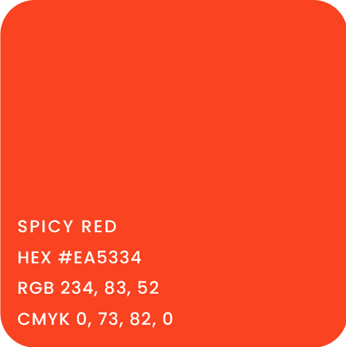
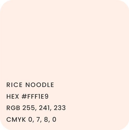
I carried this theme into the new visual identity, pulling forward the vibrant, orange-red as the primary color. The creamy white serves as a warm neutral background for the red, while the mature blue adds a bit of contrast and visual interest.


Typography
Ohno Fatface was chosen as the primary typeface as it is bold & memorable and easily grabs the attention of customers passing by the store. It was designed to work well when printed large (or even huge).
Demos next is used as the secondary typeface for body copy. Both typefaces are slab serifs, fantastic for grabbing attention & establishing a sense of heritage and professionalism.
Assets
In order to add detail, personality and variation to the design I created illustrations that can be used for signage, merch, web and social media. They are hand drawn in procreate, in which adds an organic, personal and fun touch to the visual identity.
I arranged them in a pattern - another unique asset that is great for prints such as flyer or receipt backsides and wrapping paper, but can also be used for web.


